
I’m using a Vensim model with time in months. How can I change the X-Axis from numbers to time format, for example, dec-19 jan-20 feb-20 and so on?
Thanks.
Change X-Axis (time) format
Hi Andre.
You can set it in the Chart’s Properties under ‘Categories’.
They can be defined in the ‘Enter labels directly (comma separated)’ field.
Hello, thanks for the information but I’m afraid I don’t have this option in my dashboard builder, please see the image below.
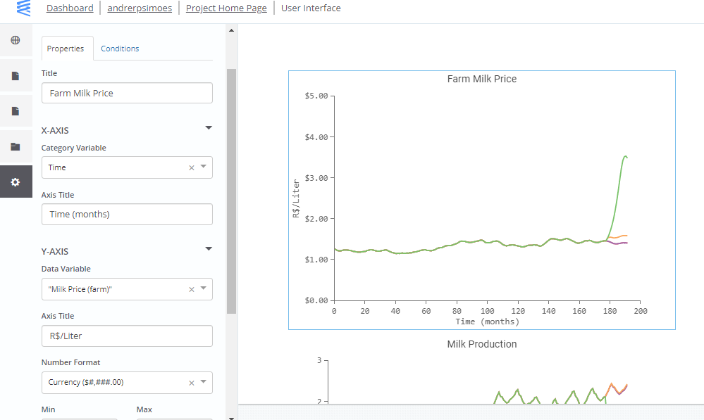
HI Andre,
Based on your screenshot and after reviewing your project, the default Dashboard page is using a Run Compare (multiple-runs) chart which doesn’t support the Category (X-Axis) feature.
Only single-run charts support the Category (X-Axis) feature.
If you add ‘Run Analysis (Single Run)’ page, you can then add a chart that supports the Category (X-Axis) feature.
Though, these charts only display single-run, you can use its accompanying radio-buttons to display the other single-run results.