Enquiry: Adding multiple input pages to run comparison project

Hi Support Team,

I want to know how I can add multiple input pages to a run comparison project. The first page should allow the user to input their initial values (baseline) and the second page should allow them to make decisions that will lead to results which they compare against the baseline.

Currently, the interface builder doesn’t allow for more than one input page. But I’ve seen that the prism-simulation contains multiple input pages as shown in one of your webinars (https://youtu.be/LIsjMGw0hUY?t=604).

What I’m trying to achieve is similar to the MIT simulation from the same webinar (https://youtu.be/LIsjMGw0hUY?t=500) but with a separate page instead of a pop-up.

Please let me know how I can achieve this.

Kind Regards
Wesley
We are currently reviewing and will let you know next week.

1 Like

Hi Forio Support Team,

Do you have any updates on this issue?

Kind regards
Wesley

Hi Wesley,

I have the same issue. And also entered a request for support on this today. Happy to share solutions and obviously interested if you could share yours.

Ragards

Joaquim de Witte

Hi–

I wanted to follow up on this. The built in pages for the interface builder for the Run Comparison templates only allow one decision page. However, you can add a “tabbed decision page” which lets you include multiple sub-pages.

To add this, you must first delete the existing decision page. Go to the menu “Pages”, and click the triple dots by decisions and then choose Delete.

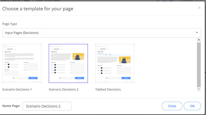
Then click Add Page and choose “Input Pages (Decisions)” and chose the page Tabbed Decisions. This will let you have multiple tabs of decisions for your sim.

The PRISM simulation has a more complex set of inputs as it is custom developed with HTML. You can create any page style you like using the Flow Js or Epicenter Js libraries instead of using the interface builder. But try the tabbed decision pages and see if this helps.

WILL

Hi Will,

Thanks for useful feedback. Still, I have more questions with respect to this item.

Is there a technical reason why all input should be on one page, with or without, tabs?
If there is no technical issue I may as well copy the HTML/JavaScript code related to the input functions (rulers etc.) to a custom template and eventually combine it with graphs.

Would be happy if you could comment on this today.

Good weekend, Joaquim

Hi,

There’s no strict reason it has to be this way. it requires some attention to the navigation/flow to have this on multiple pages. There needs to be a “Run” button which advances the model, saves the run, and navigates to the results page.

WILL