Hi,
Thanks for the note. The short answer is yes, but it’s complicated. There’s no built in option in contour to have multiple axes or multiple scales on one axis. (you can have multiple lines, just not different scales, by default).
To make this work, you’ll need to directly edit the HTML of your simulation, and include some JavaScript. (The interface builder – our template mechanism for producing graphs, can be used to create an initial prototype, but you’ll have to hand edit the page to include non-standard customizations).
We did some brainstorming and came up with three ways to make this work
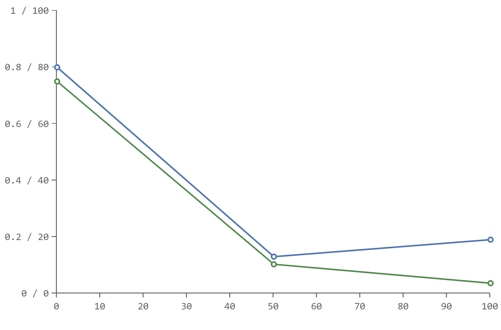
(1) One approach would be to filter the data before passing it in to and scale it to all be in the same range. (e.g. divide capabilities by 100 so the actual value being passed in are 0 to 1). Then change the label of the y Axis to show
0 / 0
.1 / 10
.2 / 20
.3 / 30
…
1 / 100
You can change the label of the Y axis with the contour “formatter option”
$(function () {

   var capabilitiesData = [{x: 0, y: 80},{x: 50, y: 13},{x: 100, y: 19}]
   var dimensionlessData = [{x: 0, y: 0.75},{x: 50, y: 0.103},{x: 100, y: 0.036}];

   var adjustedCapabilitiesData = capabilitiesData.map(function(data) { return {x: data.x, y: data.y / 100}; });

    var data = [
        {name: 'Capabilities', data: adjustedCapabilitiesData},
        {name: 'Dimensionless', data: dimensionlessData}
    ];

    new Contour({
            el: '.line-multi-basic',
            yAxis: {
                labels: {formatter: function (x) { return  x + " / " + (x*100); } }
            }
        })
        .cartesian()
        .line(data)
        .render();
});
which produces a graph like this:
(2) A second way of handling this, would be to use a d3 (a visualization library) to draw an extra axis on the right of the chart. Contour is built upon d3, and can take additional d3 elements. This requires further JavaScript programming. There’s examples in the Contour gallery about combining Contour and D3 (http://forio.com/contour/gallery.html) but it’s more involved.
(3) A final way of handling this is to create a custom Contour chart type. Contour is an open source library, hosted at https://github.com/forio/contour . It’s designed to be extended with new Chart types. Again, this requires JavaScript programming and is probably beyond what you are looking for. But the advantage is that once this is done, it could automatically scale the data to fit in the graph frame, and draw the correct axis, without any additional coding for new graphs. Let us know if this is something you’d like our consultants to help with.
Regards, WILL